![[banner]](images/banner.jpg "Cohansey River, Fairfield, New Jersey")
Sankey Plot
Sankey plots and alluvial plots are related plots that help visualize flows between populations or time points. Each box on the plot is called a node. The flows between the nodes are called flows or links. The points along the x-axis are called stages. The data required is simply the value of the amount of flow between each pair of nodes.
For these examples, the following information will be used.
365 days in a year
Of 365 days, 104 are weekends, and 261 are weekdays
Of weekends, 52 are Saturdays, 52 are Sundays
Of Saturdays, there are 10 days I took the dogs to the park,
and 42 days I didn’t take the dogs to the park
Of Sundays, there are 21 days I took the dogs to the park,
and 31 days I didn’t take the dogs to the park
Sankey plot with networkD3 package
Some code for the following example taken from The R Graph Gallery (2025).
if(!require(networkD3)){install.packages("networkD3")}
if(!require(tidyverse)){install.packages("tidyverse")}
if(!require(webshot)){install.packages("webshot")}
library(networkD3)
library(tidyverse)
Here, we’ll start with a table of nodes and values of flows between these nodes.
You could also enter this data as a data frame, such as is shown in the data frame Links below.
The vector myColor is used to define the colors that will be used for the nodes.
D1 = as.matrix(read.table(header=TRUE, row.names=1, text="
Before Days Weekday Weekend Saturday Sunday DogsToPark NoDogsToPark
Days 0 261 104 0 0 0 0
Weekday 0 0 0 0 0 0 0
Weekend 0 0 0 52 52 0 0
Saturday 0 0 0 0 0 10 42
Sunday 0 0 0 0 0 21 31
DogsToPark 0 0 0 0 0 0 0
NoDogsToPark 0 0 0 0 0 0 0
"))
Links0 = rownames_to_column(.data=as.data.frame(D1), var="source")
Links1 = gather(data=Links0, key="target", value="value",
-1)
Links = filter(.data=Links1, value != 0)
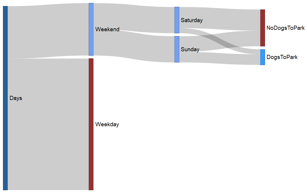
Links
source target value
1 Days Weekday 261
2 Days Weekend 104
3 Weekend Saturday 52
4 Weekend Sunday 52
5 Saturday DogsToPark 10
6 Sunday DogsToPark 21
7 Saturday NoDogsToPark 42
8 Sunday NoDogsToPark 31
Nodes = unique(data.frame(name=c(as.character(Links$source),
as.character(Links$target))))
Links$IDsource = match(Links$source, Nodes$name)-1
Links$IDtarget = match(Links$target, Nodes$name)-1
Links
source target value IDsource IDtarget
1 Days Weekday 261 0 4
2 Days Weekend 104 0 1
3 Weekend Saturday 52 1 2
4 Weekend Sunday 52 1 3
5 Saturday DogsToPark 10 2 5
6 Sunday DogsToPark 21 3 5
7 Saturday NoDogsToPark 42 2 6
8 Sunday NoDogsToPark 31 3 6
myColor = 'd3.scaleOrdinal() .domain(["Days" ,
"Weekday" , "Weekend" , "Saturday",
"Sunday", "DogsToPark", "NoDogsToPark"])
.range( ["#104E8B",
"#8B1A1A", "#6495ed", "#6495ed",
"#6495ed", "#1E90FF", "#8B1A1A"])'
Plot01 = sankeyNetwork(Links = Links, Nodes = Nodes,
Source = "IDsource", Target = "IDtarget",
Value = "value", NodeID = "name",
fontSize = 18,
fontFamily = "Arial",
colourScale = myColor,
sinksRight=FALSE)
Plot01
Saving the plot
The code above should display a network file in the RStudio Viewer window. This file will be interactive, and mousing over the flows will display the numbers in the flow.
The file can be saved as an .html file.
saveNetwork(Plot01, "Sankey01.html")
This .html file can be converted to an image file.
library(webshot)
webshot("Sankey01.html",
"Sankey01.png",
vwidth = 1200,
vheight = 675)
Sankey plot with ggsankey package
The ggsankey package uses data in a different format. Here, the data is defined by a variable for each stage in the diagram.
The example we’re using here causes a slight hiccup with this data format because not every stage has the same number of observations. In the code below, we side-step this problem with a few tricks. First, the categories we don’t want displayed are listed in the data as NA. Then, the color for the nodes and the color for the labels of the NA observations are changed to transparent, so they will not be visible.
The advantage of this package is that it allows for a lot of customization of the output, as in the ggplot2 package.
Several elements are manually adjusted. Labels is a vector representing the labels for the nodes. NodeFill is a vector for the fill colors for the nodes. NodeFill is a vector for the outline colors for the nodes. Nudge is a vector for the amount to move the label for each node. Finally, XLabel is a vector for the labels for the stages at the bottom of the plot.
For each of these, the user has to be careful to match the colors and labels to the correct nodes in the correct order.
There is an option to use geom_sankey_label() instead of geom_sankey_text() to produce labels in boxes for the nodes.
if(!require(remotes)){install.packages("remotes")}
library(remotes)
remotes::install_github("davidsjoberg/ggsankey")
library(ggplot2)
library(ggsankey)
Here, the data is entered as a data frame, using the same data as in the example above.
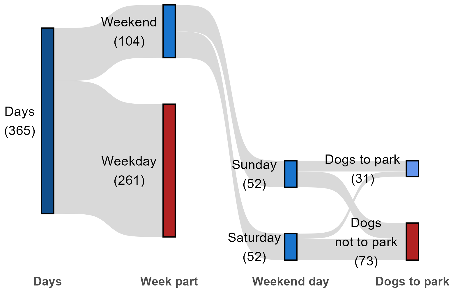
Data0 = read.table(header=TRUE, stringsAsFactors=TRUE, text="
Days WeekPart Weekend DogsToPark Freq
Days Weekend Saturday DogsToPark 10
Days Weekend Saturday DogsNotToPark 42
Days Weekend Sunday DogsToPark 21
Days Weekend Sunday DogsNotToPark 31
Days Weekend NA NA 0
Days Weekday Saturday DogsToPark 0
Days Weekday Saturday DogsNotToPark 0
Days Weekday Sunday DogsToPark 0
Days Weekday Sunday DogsNotToPark 0
Days Weekday NA NA 261
")
Data1 = Data0[rep(row.names(Data0), Data0$Freq),
c("Days", "WeekPart",
"Weekend","DogsToPark")]
Data = make_long(Data1, Days, WeekPart, Weekend, DogsToPark)
Labels and colors determined manually
Labels = c("Days\n(365)", "Weekday\n(261)",
"Weekend\n(104)",
"Saturday\n(52)","Sunday\n(52)", "",
"Dogs\nnot to park\n(73)", "Dogs to park\n(31)",
"")
XLabel = c("Days", "Week part", "Weekend day",
"Dogs to park")
NodeFill = c("dodgerblue4", "firebrick",
"dodgerblue3",
"dodgerblue3", "dodgerblue3",
"transparent",
"firebrick",
"cornflowerblue","transparent")
Nudge = c(-0.23, -0.33, -0.33, -0.3, -0.3, -0, -0.38, -0.41, -0)
NodeColor = c(rep("black",5), "transparent",
rep("black",2), "transparent")
Build the Sankey plot
Plot02 = ggplot(Data,
aes(x = x,
next_x = next_x,
node = node,
next_node = next_node,
fill = 1)) +
geom_sankey(flow.alpha = 1,
flow.fill = "gray85",
node.color = NodeColor,
node.fill = NodeFill) +
theme_sankey(base_size = 11) +
scale_x_discrete(labels = XLabel) +
labs(x = "") +
geom_sankey_text(label = Labels,
color = 1,
position = position_nudge(x = Nudge)) +
theme(legend.position = "none",
axis.text.x = element_text(size=10, face="bold"))
Plot02
Save the plot as an image
ggsave("Sankey02.png",
plot = Plot02,
device = "png",
width = 6,
height = 4,
units = "in",
dpi = 300)
References
The R Graph Gallery. 2025. Most basic Sankey Diagram. r-graph-gallery.com/321-introduction-to-interactive-sankey-diagram-2.html