![[banner]](images/banner.jpg "Cohansey River, Fairfield, New Jersey")
There are occasions when it is useful to categorize Likert scores, Likert scales, or continuous data into groups or categories. In general, there are no universal rules for converting numeric data to categories. A few methods are presented here.
Categorizing data by a range of values
One approach is to create categories according to logical cut-off values in the scores or measured values. An example of this is the common grading system in the U.S. in which a 90% grade or better is an “A”, 80–89% is “B”, etc. It is common in this approach to make the categories with equal spread in values. For example, there is a 10 point spread in a “B” grade and a 10 point spread in a “C” grade. But this equality is not required. Below in the “Categorize data by range of values” example, 5-point Likert data are converted into categories with 4 and 5 being “High”, 3 being “Medium”, and 1 and 2 being “Low”.
This approach relies on the chosen cut-off points being meaningful. For example, for a grade of 70–79 to be considered “sufficient”, the evaluation instruments (e.g. the tests, quizzes, and assignments) need to be calibrated so that a grade of 75 really is “sufficient”, and not “excellent” or “good”, etc. You can imagine a case where a 4 or 5 on a 5-point Likert item is considered “high”, but if all respondents scored 4 or 5 on the item, it might not be clear that these values are “high”, but may just be the typical response. Likewise, in this case, the decision to group 4 and 5 as “high” needs be compared with a decision to group 4 with 2 and 3 as “medium”. This breakdown may be closer to how people interpret a 5-point Likert scale. Either grouping could be meaningful depending on the purpose of the categorization and the interpretation of each level in the Likert item.
Categorizing data by percentiles
A second approach is to use percentiles to categorize data. Remember, the value for the 90th percentile is the score or measurement below which 90% of respondents scored.
The advantage to this approach is that it does not rely on the scoring system being meaningful in its absolute values. That is, students scoring above the 90th percentile are scoring higher than 90% of students. It doesn’t matter if the score for the 90th percentile is 90 out of 100 or 50 out of 100. If the groups use equally-spaced breakpoints, for example 0th, 25th, 50th, 75th, and 100th percentiles, there should be approximately an equal number of respondents in each category.
Categorizing data with clustering
A third approach is to use a clustering algorithm to divide data into groups with similar measurements. This is useful when there are multiple measurements for an individual. For example, if students receive scores on reading, math, and analytical thinking, an algorithm can determine if, for example, there is a group of students who do well on all three measurements, and a group of students who do well in math and analysis but who do poorly on reading. Most clustering algorithms assume that measurement data is continuous in nature. Below, the partitioning around medoids (PAM) method is used with the manhattan metric. This may be relatively more suitable for ordinal data than some other methods
Packages used in this chapter
The packages used in this chapter include:
• psych
• cluster
• fpc
The following commands will install these packages if they are not already installed:
if(!require(psych)){install.packages("psych")}
if(!require(cluster)){install.packages("cluster")}
if(!require(fpc)){install.packages("fpc")}
Examples for converting numeric data to categories
Input =("
Instructor Student Likert
Homer a 3
Homer b 4
Homer c 4
Homer d 4
Homer e 4
Homer f 5
Homer g 5
Homer h 5
Homer i 3
Homer j 2
Homer k 3
Homer l 4
Homer m 5
Homer n 5
Homer o 5
Homer p 4
Homer q 4
Homer r 3
Homer s 2
Homer t 5
Homer u 3
")
Data = read.table(textConnection(Input),header=TRUE)
### Check the data frame
library(psych)
headTail(Data)
str(Data)
summary(Data)
### Remove unnecessary objects
rm(Input)
Categorize data by range of values
The following example will categorize responses on a single 5-point Likert item. The algorithm will be a score of 1 or 2 will be called “low”, a score of 3 “medium”, and a score of 4 or 5 “high”.
Categorize data
Data$Category[Data$Likert == 1 | Data$Likert == 2] = "Low"
Data$Category[Data$Likert == 3 ] = "Medium"
Data$Category[Data$Likert == 4 | Data$Likert == 5] = "High"
Data
Order factor levels to make output easier to read
Data$Category = factor(Data$Category,
levels=c("Low", "Medium",
"High"))
Summarize counts of categories
XT = xtabs(~ Category + Instructor,
data = Data)
XT
Instructor
Category Homer
Low 2
Medium 5
High 14
Report students in each category
Data$Student[Data$Category == "Low"]
[1] j s
Data$Student[Data$Category == "Medium"]
[1] a i k r u
Data$Student[Data$Category == "High"]
[1] b c d e f g h l m n o p q t
Alternate method with tapply
tapply(X = Data$Student,
INDEX =
Data$Category,
FUN = print)
$Low
[1] j s
$Medium
[1] a i k r u
$High
[1] b c d e f g h l m n o p q t
Summary table
Category Range Count Students
Low 1 or 2 2 j, s
Medium 3 5 a, i, k, r, u
High 4 or 5 14 b, c, d, e, f, g, h, l, m, n, o, p, q, t
Categorize data by percentile
The following example will categorize responses on a single 5-point Likert item. Respondents scoring below the 33rd percentile will be labeled “Lower third”; those between the 33rd and 67th percentile “Middle third”; and those above the 67th percentile “Upper third”.
Categorize data
Percentile_00 = min(Data$Likert)
Percentile_33 = quantile(Data$Likert, 0.33333)
Percentile_67 = quantile(Data$Likert, 0.66667)
Percentile_100 = max(Data$Likert)
RB = rbind(Percentile_00, Percentile_33, Percentile_67, Percentile_100)
dimnames(RB)[[2]] = "Value"
RB
Value
Percentile_00 2.0000
Percentile_33 3.6666
Percentile_67 4.3334
Percentile_100 5.0000
Data$Group[Data$Likert
>= Percentile_00 & Data$Likert < Percentile_33] =
"Lower_third"
Data$Group[Data$Likert >= Percentile_33 & Data$Likert <
Percentile_67] = "Middle_third"
Data$Group[Data$Likert >= Percentile_67 & Data$Likert <=
Percentile_100] = "Upper_third"
Data
Order factor levels to make output easier to read
Data$Group = factor(Data$Group,
levels=c("Lower_third", "Middle_third",
"Upper_third"))
Summarize counts of groups
XT = xtabs(~ Group + Instructor,
data = Data)
XT
Instructor
Group Homer
Lower_third 7
Middle_third 7
Upper_third 7
Report students in each group
tapply(X = Data$Student,
INDEX = Data$Group,
FUN = print)
$Lower_third
[1] a i j k r s u
$Middle_third
[1] b c d e l p q
$Upper_third
[1] f g h m n o t
Summary table
Group Range
Count Students
Lower third 1, 2, or 3 7 a, i, j, k, r, s, u
Middle third 4 7 b, c, d, e, l, p, q
Upper third 5 7 f, g, h, m, n, o, t
Categorize data by clustering
In the following example, each student has a score for Happy and for Tired. The students will be divided into clusters based on the similarities of their scores across both measures.
Example data
Input =("
Instructor Student Happy Tired
Marge a 5 5
Marge b 5 5
Marge c 2 5
Marge d 2 5
Marge e 5 5
Marge f 5 5
Marge g 1 5
Marge h 1 5
Marge i 1 5
Marge j 5 5
Marge k 3 3
Marge l 3 3
Marge m 3 3
Marge n 5 2
Marge o 5 2
Marge p 5 1
Marge q 5 1
Marge r 5 1
Marge s 4 1
Marge t 4 1
")
Data = read.table(textConnection(Input),header=TRUE)
### Check the data frame
library(psych)
headTail(Data)
str(Data)
summary(Data)
### Remove unnecessary objects
rm(Input)
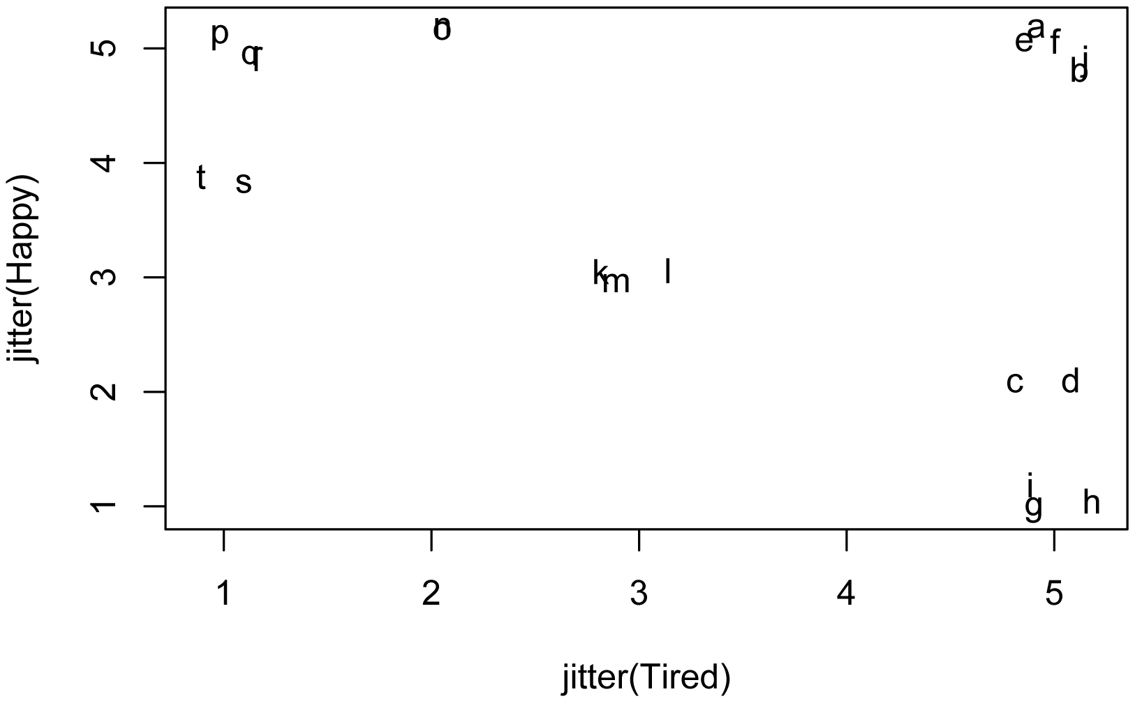
Plot data
In the following plot, each letter represents a Student from the data frame. To me, this plot suggests that the data could be reasonably clustered into 4 or perhaps 7 or 8 clusters.
plot(jitter(Happy) ~ jitter(Tired),
data = Data,
pch=as.character(Data$Student))
Use only numeric data
Data.num = Data[c("Happy", "Tired")]
Determine the optimal number of clusters
The pamk function in the fpc package can determine the optimum number of clusters for the partitioning around medoids (PAM) method. It will also complete the PAM analysis, but we’ll do that separately below.
Practical considerations may override the results of the pamk function. In the example below, if we include 1 in the possible range of cluster numbers, the function will determine that 1 is the optimum number. Also, if we extend the range to, say, 10, the function will choose 7 as the optimum number, but this may be too many for our purposes.
library(fpc)
PAMK = pamk(Data.num,
krange = 2:5,
metric="manhattan")
PAMK$nc
[1] 4
### This is the optimum number of clusters in the
range
plot(PAMK$crit)
lines(PAMK$crit)
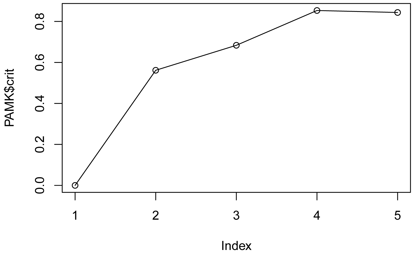
For the range of cluster numbers shown on the x-axis,
the crit value is maximized at 4, suggesting 4 is optimum number of clusters
for this range.
Categorize data
We will use the pam function in the cluster package to divide our data into four clusters.
library(cluster)
PAM = pam(x = Data.num,
k = 4, ### Number of
clusters to find
metric="manhattan")
PAM
Medoids:
ID Happy Tired
[1,] 10 5 5
[2,] 9 1 5
[3,] 13 3 3
[4,] 16 5 1
Clustering vector:
[1] 1 1 2 2 1 1 2 2 2 1 3 3 3 4 4 4 4 4 4 4
### Add clusters to data frame
PAMClust = rep("NA", length(Data$Likert))
PAMClust[PAM$clustering == 1] = "Cluster 1"
PAMClust[PAM$clustering == 2] = "Cluster 2"
PAMClust[PAM$clustering == 3] = "Cluster 3"
PAMClust[PAM$clustering == 4] = "Cluster 4"
Data$Cluster = PAMClust
Data
Order factor levels to make output easier to read
Data$Cluster = factor(Data$Cluster,
levels=c("Cluster 1", "Cluster 2",
"Cluster 3", "Cluster 4"))
Summarize counts of groups
XT = xtabs(~ Cluster + Instructor,
data = Data)
XT
Instructor
Cluster Marge
Cluster 1 5
Cluster 2 5
Cluster 3 3
Cluster 4 7
Report students in each group
tapply(X = Data$Student,
INDEX = Data$Cluster,
FUN = print)
$`Cluster 1`
[1] a b e f j
$`Cluster 2`
[1] c d g h i
$`Cluster 3`
[1] k l m
$`Cluster 4`
[1] n o p q r s t
Summary table
Cluster Interpretation
Count Students
Cluster 1 Tired and happy 5 a, b, e, f, j
Cluster 2 Tired and not happy 5 c, d, d, h, i
Cluster 3 Middle of the road 3 k, l, m
Cluster 4 Not tired and happy 7 n, o, p, q, r, s, t
Final plot
ggplot(Data,
aes(x = Tired,
y = Happy,
color = Cluster)) +
geom_point(size=3) +
geom_jitter(width = 0.4, height = 0.4) +
theme_bw()
