![[banner]](images/banner.jpg "Cohansey River, Fairfield, New Jersey")
Packages used in this chapter
The packages used in this chapter include:
• lattice
• plyr
• ggplot2
• ggbeeswarm
• FSA
• DescTools
• vcd
• rcompanion
The following commands will install these packages if they are not already installed:
if(!require(lattice)){install.packages("lattice")}
if(!require(plyr)){install.packages("plyr")}
if(!require(ggplot2)){install.packages("ggplot2")}
if(!require(ggbeeswarm)){install.packages("ggbeeswarm")}
if(!require(FSA)){install.packages("FSA")}
if(!require(DescTools)){install.packages("DescTools")}
if(!require(vcd)){install.packages("vcd")}
if(!require(rcompanion)){install.packages("rcompanion")}
The need to understand plots
There are several reasons why it is important to be able to produce and interpret plots of data.
Visualize your data. Plots are essential for visualizing and exploring your data. Plotting a histogram gives a sense of the range, center, and shape of the data. It shows if the data is symmetric, skewed, bimodal, or uniform. Box plots and plots of means, medians, and measures of variation visually indicate the difference in means or medians among groups. Scatter plots show the relationship between two measured variables.
Communicate your results to others. Being able to choose and produce appropriate plots is important for summarizing your data for professional or extension presentations and journal articles. Plots can be very effective for summarizing data in a visual manner and can show statistical results with impact.
Understand other’s results. It is essential to understand the plots you find in extension and professional literature.
Some advice on producing plots
For some good advice on producing high-quality plots, read the “General tips” section of the McDonald page listed in the “Optional readings I” section.
His basic points:
• “Don’t clutter up your graph with unnecessary junk.”
• “Include all necessary information.”
• “Don’t use color in graphs for publication.”
• “Do use color in graphs for presentations.”
Producing clear and informative plots
There are many ways to make a bad plot. As McDonald notes, one way is to have a cluttered or unclear plot, and another is to use color inappropriately.
I strive for clear, bold text, lines and points. In a presentation, it can be difficult for the audience to understand busy plots, or see thin text, lines, or subtle distinctions of colors. Publications may or may not accept color in plots, and subtle shading or hatching may not be preserved. Sometimes the resolution of images of plots are downsampled, making small text or symbols unclear.
In general, a plot and its caption should more-or-less be able to stand alone. Obviously, you can’t describe your whole study in a caption, but it is helpful to give enough information so that the figure is informative if it were separated from the rest of the article or presentation. The amount of information will be tempered by the style of medium you’re writing for, journal versus factsheet, for example. In a scientific article, you may wish to include the subjects (“students in seventh grade who had completed a 4-H program in robotics”), location, time period, and other relevant information.
Be sure to label axes as thoroughly as possible, and also accurately. For example, an “increase in student scores” is not the same as “student scores.” Indicate if the values are cumulative, total, monthly, etc.
When possible, plots should show some measures of variation, such as standard deviation, standard error of the mean, or confidence interval. By their nature, histograms and box plots show the variation in the data. Plots of means or medians will need to have error bars added to show dispersion or confidence limits.
If applicable, usually the x-axis is the independent variable and the y-axis is the dependent variable of an analysis.
Misleading plots
You should also avoid making misleading plots. Remember that you are trying to accurately summarize your data and show the relationships among variables. It takes care to do this accurately and in a way that won’t confuse or mislead your reader.
The “Optional analyses” section on “Misleading and disorienting plots” near the end of this chapter gives some examples of plots I’ve seen that display their shortcomings.
Using software to produce plots
The plots in this book will be produced using R. R has the capability to produce informative plots quickly, which is useful for exploring data or for checking model assumptions. It also has the ability to produce more refined plots with more options, quintessentially through using the package ggplot2.
Sometimes it is easier to produce plots using software with a graphic user interface like Microsoft Excel, Apple Numbers, or free software like LibreOffice Calc.
In general, you should use whichever tool will best serve your purposes.
Exporting plots
Exporting through RStudio Plots window
RStudio makes exporting plots from R relatively easy. When plots are created in RStudio, they appear in the Plots window and can then be exported as .jpg or .png files. For higher-resolution images, images can be exported as .pdf, and then converted to an image with software like GIMP or Photoshop.
Saving plots directly to disk
For the most control with how plots look, it’s helpful to save plots directly to disk without using the RStudio Plots window.
First, it’s helpful to see what disk location R is using for the working directory, so that you know where plots are stored for this session.
getwd()
"C:/Users/Sal Mangiafico/Desktop"
In the following example, the png() function will send the output of the following ggplot() call to a file. It’s important afterward to call dev.off() to return the output channel to RStudio.
### Load the data
Palmer =
read.csv("https://rcompanion.org/documents/PalmerPenguins.csv")
Palmer$Island = Palmer$island
### Plot and output to .png
library(ggplot2)
png(filename = "Palmerplot01.png",
width = 6,
height = 3.5,
units = "in",
res = 300)
ggplot(Palmer, aes(x=flipper_length_mm, y=bill_length_mm, color=Island)) +
geom_point() +
theme_bw() +
theme(
axis.title = element_text(face = "bold")) +
xlab("\nFlipper length (mm)") +
ylab("Bill length (mm)\n")
dev.off()
Another way to save a plot to disk is to use the ggsave() function.
Plot = ggplot(Palmer, aes(x=flipper_length_mm, y=bill_length_mm, color=Island))
+
geom_point() +
theme_bw() +
theme(
axis.title = element_text(face = "bold")) +
xlab("\nFlipper length (mm)") +
ylab("Bill length (mm)\n")
ggsave(filename="Palmerplot02.png",
plot = Plot,
width = 6,
height = 3.5,
dpi = 300,
units = "in")

Examples of basic plots for interval/ratio and ordinal data
There are many types of plots, and this chapter will present only a few of the most common ones. In later chapters, variants of these plots will be used to explore the data or to check the assumptions of the analyses.
The type of plot you choose will depend upon on the number and types of variables you are trying to present, and what you are trying to show.
For this example, extension educators had students wear pedometers to count their number of steps over the course of a day. The following data are the result. Rating is the rating each student gave about the usefulness of the program, on a 1-to-10 scale.
Note the code that orders the levels of the factor variables. In general, R will alphabetize levels of factors, and this may be reflected on plots. The code will order the factor by the order that the levels are encountered in the dataset.
Data = read.table(header=TRUE, stringsAsFactors=TRUE, text="
Student Gender Teacher Steps Rating
a female Catbus 8000 7
b female Catbus 9000 10
c female Catbus 10000 9
d female Catbus 7000 5
e female Catbus 6000 4
f female Catbus 8000 8
g male Catbus 7000 6
h male Catbus 5000 5
i male Catbus 9000 10
j male Catbus 7000 8
k female Satsuki 8000 7
l female Satsuki 9000 8
m female Satsuki 9000 8
n female Satsuki 8000 9
o male Satsuki 6000 5
p male Satsuki 8000 9
q male Satsuki 7000 6
r female Totoro 10000 10
s female Totoro 9000 10
t female Totoro 8000 8
u female Totoro 8000 7
v female Totoro 6000 7
w male Totoro 6000 8
x male Totoro 8000 10
y male Totoro 7000 7
z male Totoro 7000 7
")
### Order the factors, otherwise R with
alphabetize them
Data$Gender = factor(Data$Gender,
levels=unique(Data$Gender))
Data$Teacher = factor(Data$Teacher,
levels=unique(Data$Teacher))
### Check the data frame
Data
str(Data)
summary(Data)
Histogram
A histogram shows the frequency of observations broken down into ranges, to give a sense of the range and distribution of the data.
• A single histogram is used for one interval/ratio or ordinal variable.
• Multiple histograms can be put on one plot to compare among groups.
• If you want to make a histogram for counts of a categorical variable in R, you will want to use a bar plot.
Note that col defines the colors of the bars; main defines the main plot title; xlab defines the label on the x-axis.
Simple histogram
hist(Data$Steps,
col="gray",
main="",
xlab="Steps")

Frequency histogram of the number of
steps taken by students in three classes.
Histogram with density line
This plot will add a curve for the density of the data in the histogram, which is a smoothed-out representation of the distribution of the data.
The function plotDensityHistogram will produce this plot. Options include the options for the hist function as well as adjust, bw, and kernel, which is passed to the density function.
library(rcompanion)
x = Data$Steps
plotDensityHistogram(x,
adjust = 1) ### Decrease
this number
### to make line less smooth
Histogram of the number of steps taken
by students in three classes with the smoothed gaussian kernel density shown as a black
curve.
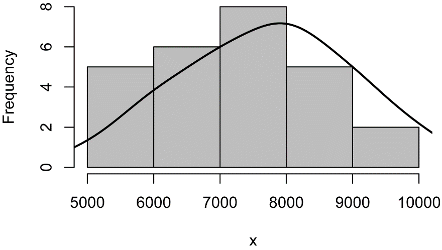
Histogram with normal curve
This plot will add a normal curve with the mean and standard deviation of the data in the histogram. This type of plot will be useful to visually determine is a distribution of data is close to normal.
The function plotNormalHistogram will produce this plot. Options include the options for the hist function as well as linecol for the line color.
x = Data$Steps
library(rcompanion)
plotNormalHistogram(x)

Histogram of the number of steps taken
by students in three classes with a normal distribution of the same mean and standard
deviation shown in blue.
Histogram for one-way data
The lattice package can be used to put multiple histograms on one plot for grouped data. This is useful to compare data distributions among groups. Notice the grammar used in the formula in the histogram function, and the need to indicate into how many columns and rows the plots will be placed.
library(lattice)
histogram(~ Steps | Sex,
data=Data,
layout=c(1,2)
# columns and rows of individual
plots
)
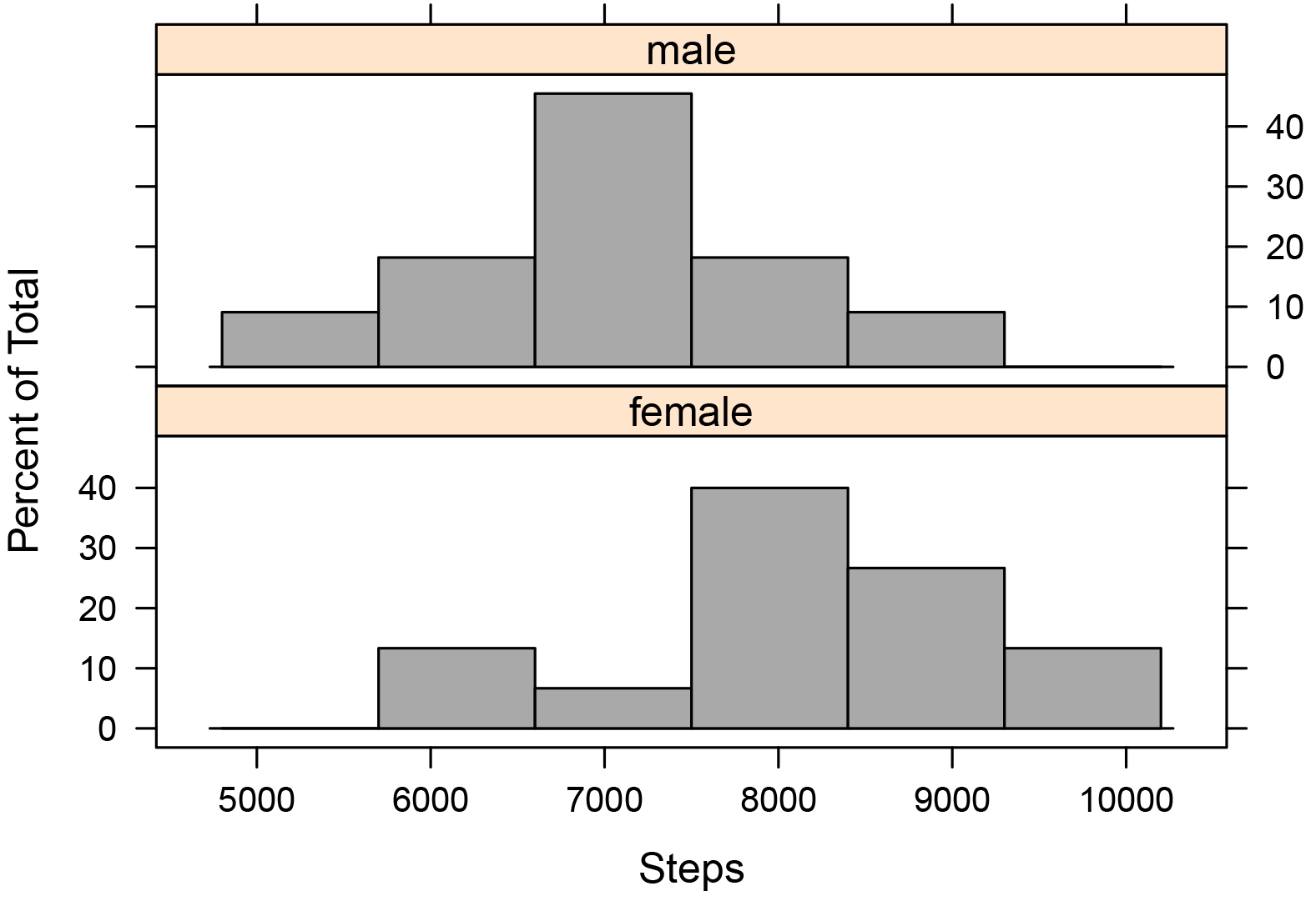
Histograms of the number of steps taken
by male and female students across three classes.
Histogram for two-way data
library(lattice)
histogram(~ Steps | Teacher +
Sex,
data=Data,
layout=c(3,2)
# columns and rows of individual
plots
)
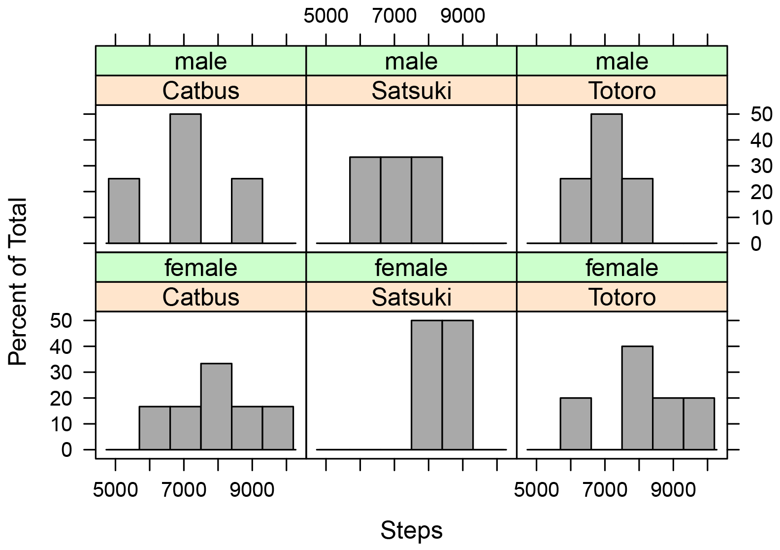
Histograms of the number of steps taken
by male and female students in each of the classes of Catbus, Satsuki,
and Totoro.
Box plots
Box plots graphically present the five-number summary. The main box indicates the 25th and 75th percentile of the plotted data. The median is indicated with a heavy line through the box. The whiskers extending from the box indicate the range of the data, but different software packages may use somewhat different statistics for the extent of the whiskers. For this reason, when you are presenting box plots, you should always specify what the length of whiskers indicate.
By default, the whiskers in the boxplot function indicate the range of the data, unless there are data that are further away from the box than 1.5 times the length of the box. In this case, the whiskers extend only 1.5 times the length of the box, and points beyond this distance are indicated with circles. An example of box plots with circles indicating outlying values is shown in the “Box plot for one-way data” section. If you wish to have the whiskers extend to the range of the data, and not display any point with circles, the range=0 option can be used. See ?boxplots and ?boxplot.stats for more details.
The video from Statistics Learning Center in the “Optional readings II” section may be a helpful introduction to box plots. The “Graphing Distributions” chapter in the Lane textbook in the “Optional readings II” section also has a nice description of box plots.
• A single box plot is used for one interval/ratio or ordinal variable. Don’t use means for ordinal data.
• Multiple box plots can be put on one plot to compare among groups.
Note that xlab defines the label on the x-axis; ylab defines the label on the y-axis
Simple box plot
boxplot(Data$Steps,
ylab="Steps",
xlab="")

Box plot of the number
of steps taken by students in three classes. The box indicates the 1st
and 3rd quartiles, and the dark line indicates the median.
Whiskers extend to the maximum and minimum of the data.
Box plot with means
M = mean(Data$Steps)
boxplot(Data$Steps,
ylab="Steps",
xlab="")
points(M,
col="red",
pch="+", ### symbol
to use, see ?points
cex=2) ###
size of symbol
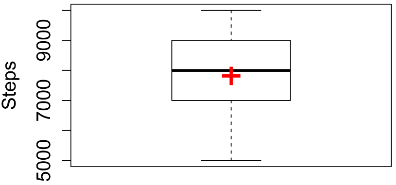
Box plot of the number
of steps taken by students in three classes. The box indicates the 1st
and 3rd quartiles, and the dark line indicates the median.
The mean is indicated with the red cross. Whiskers extend to the
maximum and minimum of the data.
Box plot for one-way data
boxplot(Steps ~ Sex,
data=Data,
ylab="Steps")
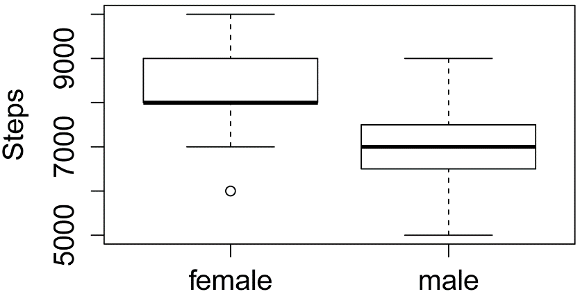
Box plots of the number
of steps taken by male and female students in three classes. The boxes indicate
the 1st and 3rd quartiles, and the dark lines
indicate the median. Points more than 1.5 times the inter-quartile
range away from the box are shown with hollow circles.
Box plot for one-way data with means
M = tapply(Data$Steps,
INDEX = Data$Sex,
FUN = mean)
boxplot(Steps ~ Sex,
data=Data,
ylab="Steps")
points(M,
col="red",
pch="+",
cex=2)

Box plots of the number of steps
taken by male and female students across three classes. The boxes indicate the 1st
and 3rd quartiles, and the dark lines indicate the median.
The means are indicated with red crosses. Points more than 1.5
times the inter-quartile range away from the box are shown with hollow
circles.
Box plot for two-way data
boxplot(Steps ~ Sex + Teacher,
data=Data,
ylab="Steps")

Box plots of the number
of steps taken by male and female students in each of three classes. The
boxes indicate the 1st and 3rd quartiles, and
the dark lines indicate the median. Points more than 1.5 times
the inter-quartile range away from the box are shown with hollow circles.
Box plot for two-way data with means
M = tapply(Data$Steps,
INDEX = Data$Teacher : Data$Sex,
FUN = mean)
boxplot(Steps ~ Sex + Teacher,
data=Data,
ylab="Steps")
points(M,
col="red",
pch="+",
cex=2)

Box plots of the number
of steps taken by male and female students in each of three classes. The
boxes indicate the 1st and 3rd quartiles, and
the dark lines indicate the median. The means are indicated with
red crosses. Points more than 1.5 times the inter-quartile range
away from the box are shown with hollow circles.
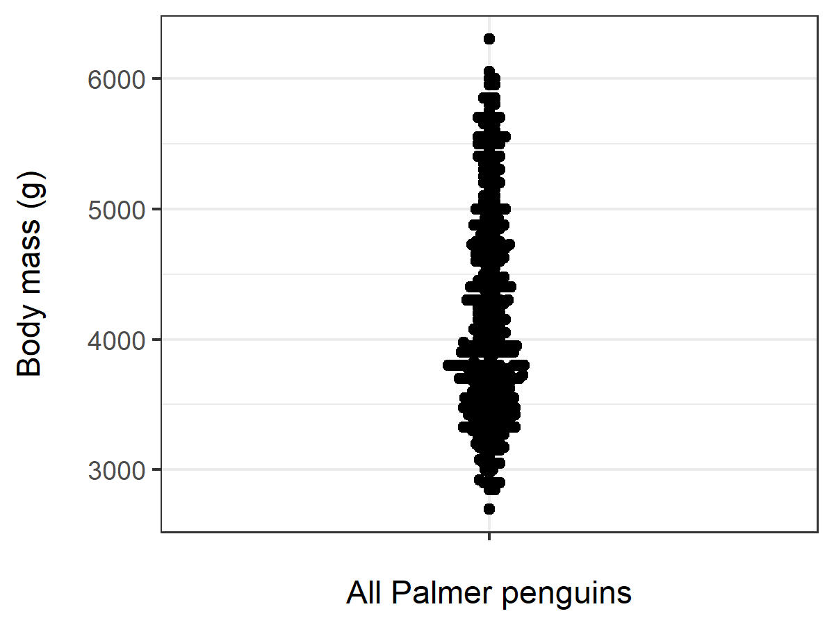
Bee swarm plots
Bee swarm plots are an alternative to box plots where every data point is shown. For small data sets, bee swarm plots are often more informative than box plots.
For these, we’ll use the Palmer’s penguins data set, simply because it’s a better example to highlight the use of this kind of plot.
Palmer0 =
read.csv("https://rcompanion.org/documents/PalmerPenguins.csv")
Palmer = Palmer0[!is.na(Palmer0$body_mass_g) ,]
### This removes observations where body_mass_g
is missing
library(ggplot2)
library(ggbeeswarm)
Simple bee swarm plot
ggplot(Palmer,aes(y=body_mass_g,x="")) +
geom_beeswarm() +
theme_bw() +
xlab("All Palmer penguins") +
ylab("Body mass (g)\n")
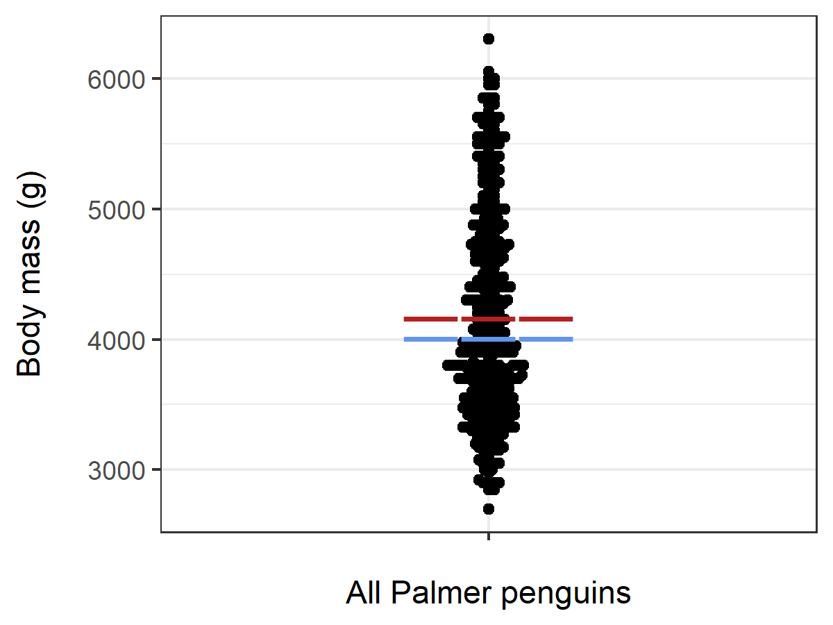
Bee swarm plot with mean and median
Here, the mean is indicated with a red line, and the median is indicated with a blue line.
M = mean(Palmer$body_mass_g)
Med = median(Palmer$body_mass_g)
ggplot(Palmer,aes(y=body_mass_g,x="")) +
geom_beeswarm() +
theme_bw() +
xlab("All Palmer penguins") +
ylab("Body mass (g)\n") +
annotate("text", label="―――", x = 1, y =
M, colour = "firebrick", size=7) +
annotate("text", label="―――", x = 1, y =
Med, colour = "cornflowerblue", size=7)
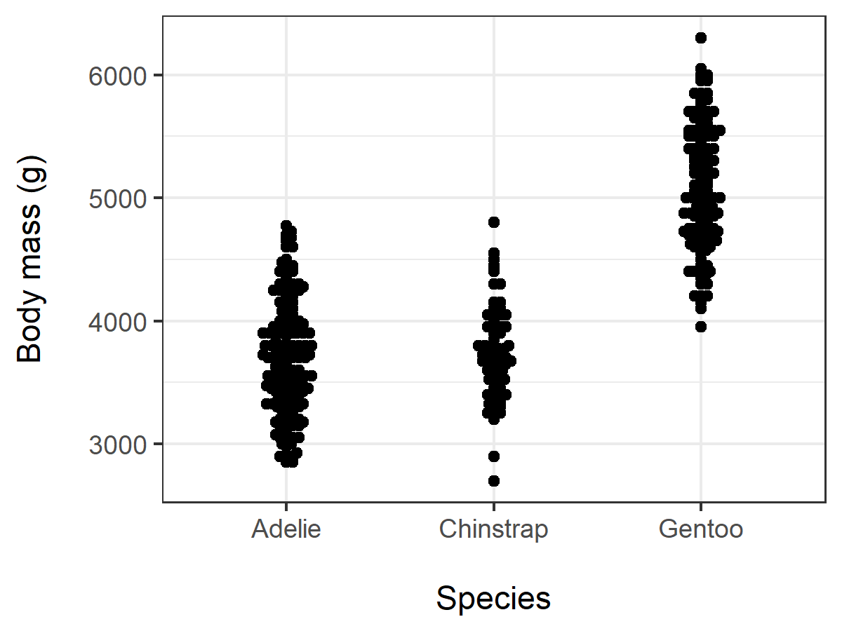
Bee swarm plot for one-way data
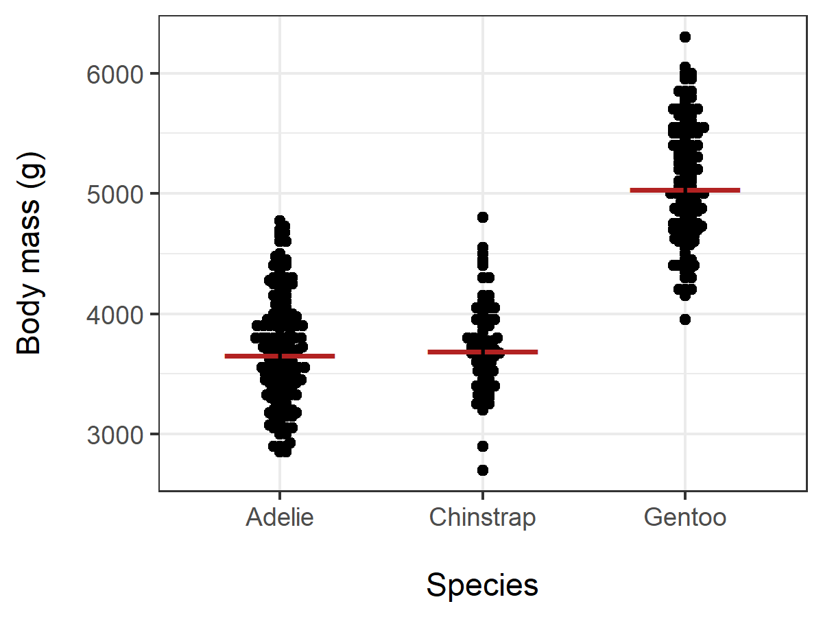
ggplot(Palmer,aes(y=body_mass_g,x=species)) +
geom_beeswarm() +
theme_bw() +
xlab("\nSpecies") +
ylab("Body mass (g)\n")
Bee swarm plot for one-way data with means
M = tapply(Palmer$body_mass_g, INDEX = Palmer$species, FUN = mean)
ggplot(Palmer,aes(y=body_mass_g,x=species)) +
geom_beeswarm() +
theme_bw() +
xlab("All Palmer penguins") +
ylab("Body mass (g)\n") +
annotate("text", label="―――", x =
1:length(M), y = M, colour = "firebrick", size=7)
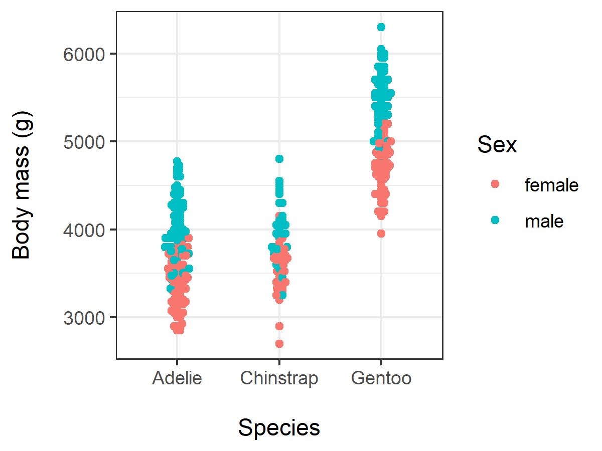
Bee swarm plot for two-way data
Palmer = Palmer0[!is.na(Palmer0$body_mass_g) &
!is.na(Palmer0$sex),]
### This removes observations where body_mass_g
or sex is missing
ggplot(Palmer,aes(y=body_mass_g,x=species,color=sex)) +
geom_beeswarm() +
theme_bw() +
xlab("\nSpecies") +
ylab("Body mass (g)\n") +
labs(colour = "Sex")
Bee swarm plot for two-way data with means
Here, we’ll use the groupwiseMean() function from the rcompanion package to calculate tbhe species × sex interaction.
library(rcompanion)
Sum = groupwiseMean(body_mass_g ~ species + sex, data=Palmer)
FM = Sum$Mean[Sum$sex=="female"]
MM = Sum$Mean[Sum$sex=="male"]
ggplot(Palmer,aes(y=body_mass_g,x=species,color=sex)) +
geom_beeswarm() +
theme_bw() +
xlab("\nSpecies") +
ylab("Body mass (g)\n") +
labs(colour = "Sex") +
annotate("text", label="――", x = 1:length(M),
y = FM, colour = "firebrick", size=7) +
annotate("text", label="――", x = 1:length(M),
y = MM, colour = "dodgerblue4", size=7)

Plot of means and interaction plots
Means or medians for a group can be plotted with error bars showing standard deviation, standard error, or confidence interval for the statistic.
For two-way data, these plots are sometimes called interaction plots.
• Each mean or median represents one group or treatment for an interval/ratio or ordinal variable. Error bars are associated with each mean or median. Don’t use means for ordinal data.
• Multiple means or medians can be plotted on the same plot, with groups from one or two independent variables.
The package ggplot2 will be used for this type of plot. A simple interaction plot can be made with the qplot function, and more refined plots can be made with the ggplot function.
The ggplot2 package is very powerful and flexible for making plots. The tradeoff is that the grammar can be difficult to understand. When trying to get a plot to look a certain way, it may be necessary to find an example plot online, and follow the code closely. Good resources include those by Hadley Wickham, Winston Chang, and Robbins and Robbins in the “References” section.
Plot of means for one-way data with qplot
In this example, we will plot means and confidence intervals. These will first be calculated with the function groupwiseMean. The output of the function is a data frame, we will call Sum. Sum will then be passed to the qplot function, so the variables mentioned in the code are from the Sum data frame.
library(rcompanion)
Sum = groupwiseMean(Steps ~ Sex,
data = Data,
conf
= 0.95,
digits
= 3)
Sum
Sex n Mean Conf.level
Trad.lower Trad.upper
1 female 15 8200
0.95 7530
8870
2 male 11 7000
0.95 6260
7740
Alternate code:
Sum = groupwiseMean(data = Data,
var =
"Steps",
group =
"Sex",
conf
= 0.95,
digits
= 3)
Sum
library(ggplot2)
qplot(x = Sex
,
y = Mean,
data = Sum) +
geom_errorbar(aes(
ymin = Trad.lower,
ymax = Trad.upper,
width = 0.15))
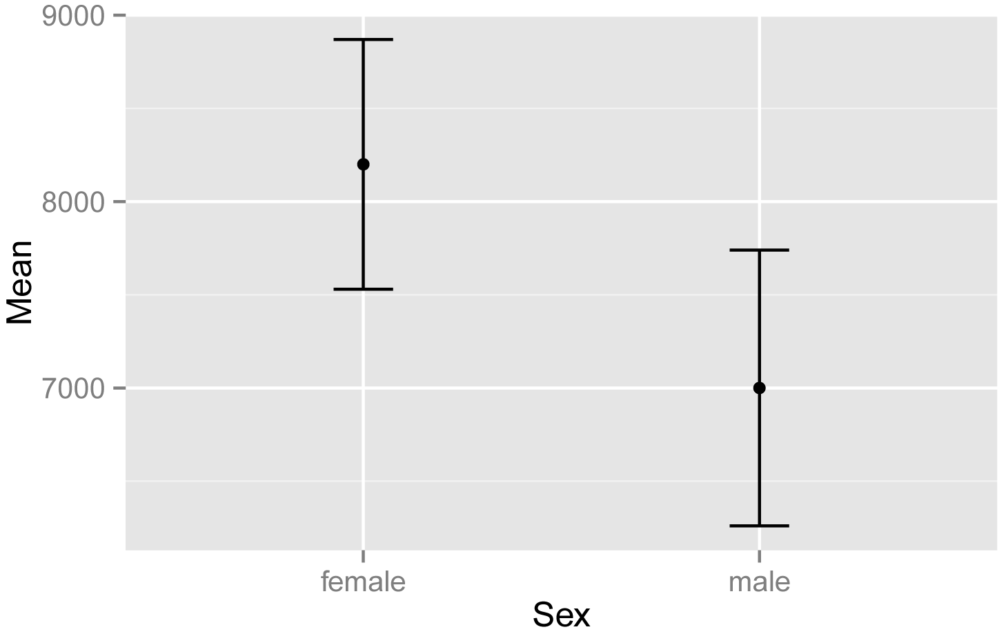
Plot of mean steps taken
versus sex, for students in the classes of Catbus, Satsuki, and Totoro.
Error bars indicate the traditional 95% confidence intervals for the
mean.
Plot of means with ggplot
This example will plot the same statistics, but will make a more attractive plot using the ggplot function. Note that the variables mentioned in the code are from the Sum data frame.
The code invokes the black-and-white visual theme with the option theme_bw.
library(rcompanion)
Sum = groupwiseMean(Steps ~ Sex,
data = Data,
conf = 0.95,
digits = 3)
Sum
Sex n Mean Conf.level
Trad.lower Trad.upper
1 female 15 8200
0.95 7530
8870
2 male 11 7000
0.95 6260
7740
Alternate code:
Sum = groupwiseMean(data = Data,
var = "Steps",
group =
"Sex",
conf = 0.95,
digits = 3)
Sum
library(ggplot2)
ggplot(Sum, ###
The data frame to use.
aes(x = Sex,
y = Mean)) +
geom_errorbar(aes(ymin = Trad.lower,
ymax
= Trad.upper),
width
= 0.05,
size = 0.5) +
geom_point(shape = 15,
size = 4) +
theme_bw() +
theme(axis.title =
element_text(face = "bold")) +
ylab("Mean
steps")

Plot of mean steps taken versus sex,
for students in the classes of Catbus, Satsuki, and Totoro. Error
bars indicate the traditional 95% confidence intervals for the mean.
Interaction plot of means with qplot
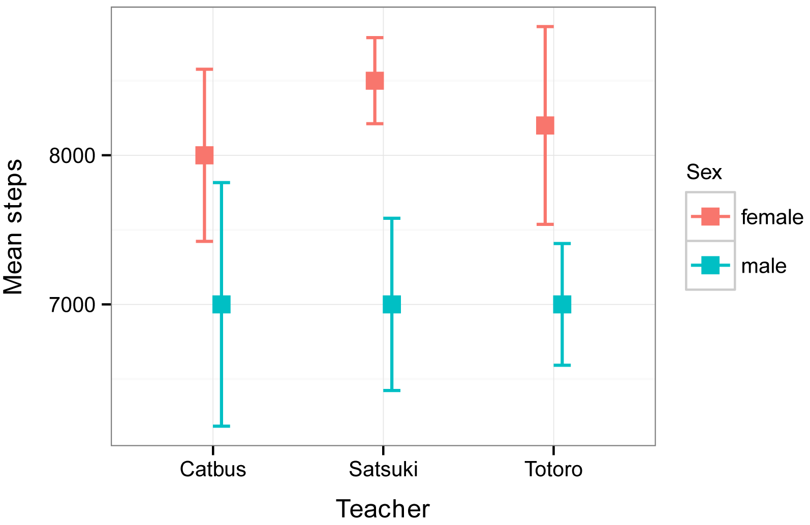
This example will plot means and standard errors for the interaction of two independent variables, Teacher and Sex.
We will use the Summarize function to produce the data frame Sum, and will then add a variable se to the data frame for the standard error.
Note that the default color palette of ggplot uses a pinkish color for the first group in the legend and a blueish color for the second. I wasn’t intentionally matching females and males with their traditional colors. These colors could be changed to avoid the appearance of gender essentialism.
library(FSA)
Sum = Summarize(Steps ~ Teacher
+ Sex,
data=Data)
Sum$se = Sum$sd / sqrt(Sum$n)
### This creates a new variable
for standard error in our summary data frame
### Replace n with nvalid if there are
missing values
Sum
Teacher Sex n nvalid mean
sd min Q1 median Q3 max percZero
se
1 Catbus female 6 6 8000 1414.2136
6000 7250 8000 8750 10000
0 577.3503
2 Satsuki female 4 4 8500
577.3503 8000 8000 8500 9000 9000
0 288.6751
3 Totoro female 5
5 8200 1483.2397 6000 8000 8000 9000 10000
0 663.3250
4 Catbus male 4
4 7000 1632.9932 5000 6500 7000 7500 9000
0 816.4966
5 Satsuki male 3
3 7000 1000.0000 6000 6500 7000 7500 8000
0 577.3503
6 Totoro male 4
4 7000 816.4966 6000 6750 7000 7250 8000
0 408.2483
library(ggplot2)
qplot(x =
Teacher,
y =
mean,
color = Sex,
data = Sum) +
geom_errorbar(aes(ymin = mean - se,
ymax = mean + se,
width = 0.15))
Interaction plot of mean steps taken
versus teacher for males and female students. Error bars indicate the
standard error of the mean.
Interaction plot of means with ggplot
As in the example above, this example will plot means and standard errors for the interaction of two independent variables, Teacher and Sex. As noted above, the pink and blue colors are the default color palette in ggplot.
library(FSA)
Sum = Summarize(Steps ~ Teacher
+ Sex,
data=Data)
Sum$se = Sum$sd / sqrt(Sum$n)
### This creates a new variable
for standard error in our summary data frame
### Replace n with nvalid if there are
missing values
Sum
Teacher Sex n nvalid mean
sd min Q1 median Q3 max percZero
se
1 Catbus female 6 6 8000 1414.2136
6000 7250 8000 8750 10000
0 577.3503
2 Satsuki female 4 4 8500
577.3503 8000 8000 8500 9000 9000
0 288.6751
3 Totoro female 5
5 8200 1483.2397 6000 8000 8000 9000 10000
0 663.3250
4 Catbus male 4
4 7000 1632.9932 5000 6500 7000 7500 9000
0 816.4966
5 Satsuki male 3
3 7000 1000.0000 6000 6500 7000 7500 8000
0 577.3503
6 Totoro male 4
4 7000 816.4966 6000 6750 7000 7250 8000
0 408.2483
library(ggplot2)
pd = position_dodge(.2)
### How much to jitter the points
on the plot
ggplot(Sum,
### The data frame to use.
aes(x
= Teacher,
y = mean,
color = Sex)) +
geom_point(shape = 15,
size = 4,
position = pd) +
geom_errorbar(aes(ymin
= mean - se,
ymax = mean + se),
width = 0.2,
size = 0.7,
position = pd) +
theme_bw() +
theme(axis.title = element_text(face = "bold")) +
ylab("Mean steps")
Interaction plot of mean steps taken
versus teacher for males and female students. Error bars indicate the
standard error of the mean.
Bar plot of means
Another common method to plot means or medians is with bar plots. Error bars can be added to each bar.
• Each bar represents one group mean or median for an interval/ratio or ordinal variable. Error bars are associated with each mean or median. Don’t use means for ordinal data.
• Multiple means or medians can be plotted on the same plot, with groups from one or two independent variables.
The barplot function can produce a simple bar plot, from a table of numbers. For more complex bar plots, or to add error bars, the ggplot2 package can be used.
Simple bar plot of means
library(FSA)
Sum = Summarize(Steps ~ Sex,
data=Data)
Sum
Sex n nvalid mean
sd min Q1 median Q3 max percZero
1 female 15 15 8200 1207.122 6000 8000
8000 9000 10000 0
2
male 11 11 7000 1095.445 5000 6500
7000 7500 9000 0
Table = as.table(Sum$mean)
rownames(Table) = Sum$Sex
Table
female male
8200
7000
barplot(Table,
ylab="Mean
steps",
xlab="Sex")

Bar plot of the mean steps taken by
female and male students in three classes.
Bar plot of means for one-way data with qplot
In this example, we will plot means and confidence intervals. These will first be calculated with the function groupwiseMean. The output of the function is a data frame, which we will call Sum. Sum will then be passed to the qplot function, so that the variables mentioned in the code are from the Sum data frame.
library(rcompanion)
Sum = groupwiseMean(Steps ~ Sex,
data = Data,
conf = 0.95,
digits = 3)
Sum
Sex n Mean Conf.level
Trad.lower Trad.upper
1 female 15 8200
0.95 7530
8870
2 male 11 7000
0.95 6260
7740
Alternate code:
Sum = groupwiseMean(data = Data,
var = "Steps",
group = "Sex",
conf = 0.95,
digits = 3)
Sum
library(ggplot2)
qplot(x = Sex
,
y = Mean,
data = Sum) +
geom_bar(stat ="identity",
fill = "gray") +
geom_errorbar(aes(ymin = Trad.lower,
ymax = Trad.upper,
width = 0.15))

Bar plot of the mean steps taken by
female and male students in three classes. Error bars indicate traditional 95%
confidence intervals of the means.
Interaction bar plot of means with ggplot
This example will plot means and standard errors for the interaction of two independent variables, Teacher and Sex. We will use the Summarize function to produce the data frame Sum, and will then add a variable se to the data frame for the standard error.
Note that the default color palette of ggplot uses a pinkish color for the first group in the legend and a blueish color for the second. These colors can be changed.
library(FSA)
Sum = Summarize(Steps ~ Teacher
+ Sex,
data=Data)
Sum$se = Sum$sd / sqrt(Sum$n)
### This creates a new variable
for standard error in our summary data frame
### Replace n with nvalid if there are
missing values
Sum
Teacher Sex n nvalid mean
sd min Q1 median Q3 max percZero
se
1 Catbus female 6 6 8000 1414.2136
6000 7250 8000 8750 10000
0 577.3503
2 Satsuki female 4 4 8500
577.3503 8000 8000 8500 9000 9000
0 288.6751
3 Totoro female 5
5 8200 1483.2397 6000 8000 8000 9000 10000
0 663.3250
4 Catbus male 4
4 7000 1632.9932 5000 6500 7000 7500 9000
0 816.4966
5 Satsuki male 3
3 7000 1000.0000 6000 6500 7000 7500 8000
0 577.3503
6 Totoro male 4
4 7000 816.4966 6000 6750 7000 7250 8000
0 408.2483
library(ggplot2)
pd = position_dodge(1)
### How much to jitter the bars
on the plot,
### 0.5 for overlapping bars
ggplot(Sum,
### The data frame to use.
aes(x
= Teacher,
y = mean,
fill = Sex)) +
geom_bar(stat = "identity",
color = "black",
position
= pd) +
geom_errorbar(aes(ymin = mean
- se,
ymax = mean + se),
width
= 0.2,
size
= 0.7,
position = pd,
color = "black"
) +
theme_bw() +
theme(axis.title
= element_text(face = "bold")) +
ylab("Mean
steps")

Bar plots of the mean steps taken by
female and male students in each of three classes. Error bars indicate the
standard error of the means.
Scatter plot
A scatter plot is used for bivariate data, to show the relationship between two interval/ratio or ordinal variables. Each point represents a single observation with one measured variable on the x-axis, and one measured variable is y-axis.
• Data are two interval/ratio or ordinal variables, paired by observation.
• Multiple plots can be shown together to investigate the relationships among multiple measured variables. (Not shown in this chapter.)
Simple scatter plot
The plot function can produce a simple bivariate scatter plot. The xlab and ylab options indicate the labels for the x- and y-axes. The jitter function is needed only in cases where individual points will overlap on the plot.
plot(Rating ~ jitter(Steps),
# jitter offsets points so you
can see them all
data=Data,
pch = 16,
# shape of points
cex = 1.0,
# size of points
xlab="Steps",
ylab="Rating")
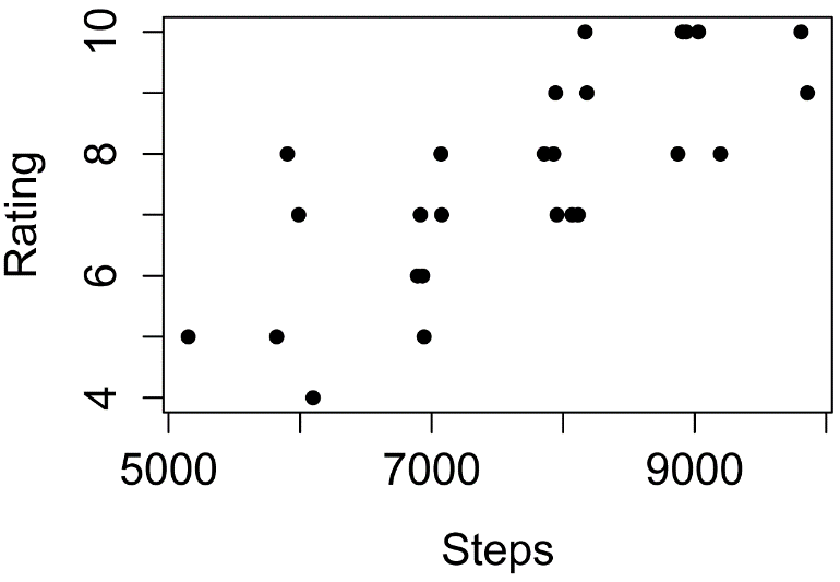
Plot of program rating versus steps
taken by students in three classes.
Scatter plot with qplot
The jitter function is needed only in cases where individual points will overlap on the plot.
qplot(x
= jitter(Steps),
y = Rating,
data = Data,
xlab = "Steps per day",
ylab = "Rating (1 – 10)")

Plot of program rating versus steps
taken by students in three classes.
Examples of basic plots for nominal data
Plots for nominal data show the counts of observation for each category of the variable.
Bar plot for counts of a nominal variable
The xtabs function is used to count observations for each level of the nominal variables, producing a contingency table.
XT = xtabs(~ Sex + Teacher, data=Data)
XT
Teacher
Sex Catbus Satsuki Totoro
female
6 4
5
male 4
3 4
barplot(XT,
beside = TRUE,
legend
= TRUE,
ylim
= c(0, 8), #
adjust to remove legend overlap
xlab = "Teacher",
ylab = "Count")
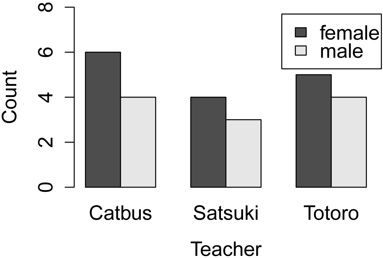
Bar plot for frequencies of observations
for female and male students in each of three classes.
Bar plot of counts and confidence intervals with ggplot
This example will plot the counts of observations for the interaction of two independent variables, Teacher and Sex. We will use the Summarize function to produce the data frame Sum, and will use the variable n as the count of observations.
It’s not necessary you understand the code completely, but in order to demonstrate error bars on this plot, 95% confidence intervals for the counts will be produced with the MultinomialCI function in the DescTools package. We call the results of this function MCI. These results will then be converted from proportions to counts and added to the Sum data frame.
We will use the scale_fill_manual option at the end of the code to change the fill on the bars to grays.
Note that this example uses two-way data in a data frame, and extracts the count of observations from the Summarize function. A similar plot, using one-way data, and starting with a vector of counts, is shown in the “Multinomial test example with plot and confidence intervals” in the Goodness-of-Fit Tests for Nominal Variables chapter.
library(FSA)
Sum = Summarize(Steps ~ Teacher
+ Sex,
data=Data)
library(DescTools)
MCI =
MultinomCI(Sum$n,
conf.level=0.95)
Total = sum(Sum$n)
Sum$lower = MCI[,'lwr.ci']
* Total
Sum$upper = MCI[,'upr.ci'] * Total
### The few lines above create
new variables in the data frame Sum
##
for the multinomial confidence intervals for n
Sum
Teacher
Sex n nvalid mean sd
min Q1 median Q3 max percZero lower
upper
1 Catbus female 6 6 8000
1414.2136 6000 7250 8000 8750 10000
0 2 11.27107
2 Satsuki female 4
4 8500 577.3503 8000 8000 8500 9000 9000
0 0 9.27107
3 Totoro female 5
5 8200 1483.2397 6000 8000 8000 9000 10000
0 1 10.27107
4 Catbus male
4 4 7000 1632.9932 5000 6500
7000 7500 9000 0
0 9.27107
5 Satsuki male 3
3 7000 1000.0000 6000 6500 7000 7500 8000
0 0 8.27107
6 Totoro
male 4 4 7000 816.4966 6000 6750
7000 7250 8000 0
0 9.27107
library(ggplot2)
pd = position_dodge(0.5)
### How much of a gap for the bars
on the plot,
### 1 for non-overlapping
bars
ggplot(Sum,
### The data frame to use.
aes(x
= Teacher,
y = n,
fill = Sex)) +
geom_bar(stat = "identity",
color = "black",
position = pd) +
geom_errorbar(aes(ymin
= lower,
ymax = upper),
width = 0.2,
size = 0.7,
position = pd,
color = "black"
) +
theme_bw() +
theme(axis.title
= element_text(face = "bold")) +
scale_fill_manual(values=
c("gray80","gray50","green")) +
ylab("Count
of observations")
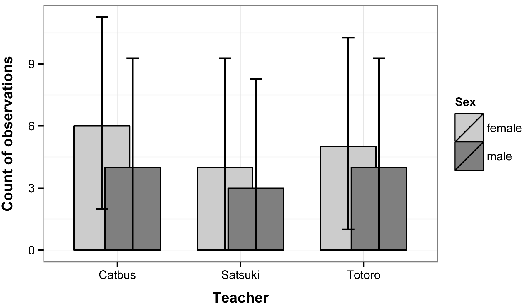
Bar plots of the counts of observations
of female and male students in each of three classes. Error bars indicate
the 95% multinomial confidence intervals for each count (Sison and Glaz
method).
Mosaic plot
A mosaic plot can be constructed with the mosaic function in the vcd package.
Interpretation of mosaic plots is discussed in the Introduction to Tests for Nominal Variables chapter.
library(vcd)
mosaic(~ Sex + Teacher,
data = Data,
shade
= TRUE,
legend = TRUE)
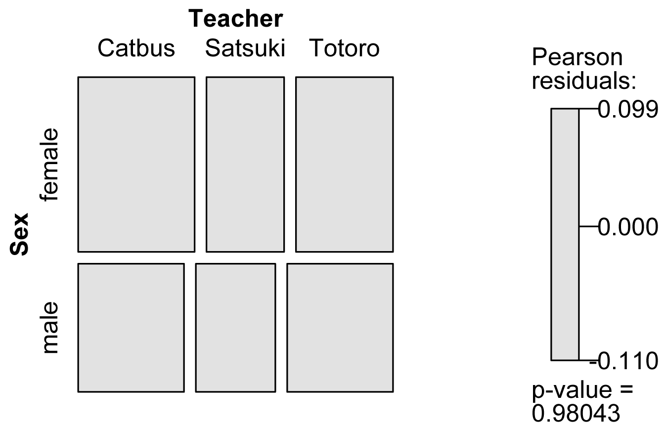
Mosaic plot for frequencies of observations
for female and male students in each of three classes.
Ordering plot categories
The order in which factor variable levels are plotted can often be controlled by ordering the levels of the factor, for example,
Data$Teacher = factor(Data$Teacher,
levels=c("Totoro", "Catbus", "Satsuki"))
levels(Data$Teacher)
[1] "Totoro" "Catbus" "Satsuki"
If you are going to be using other variables from the data frame, for example for error bars or mean separation letters, it is sometimes best to reorder the whole data frame according to the factor variable you want to use, and then reorder the levels of that variable as well. Sometimes this is overkill, but it prevents any mismatching of the observations from the different variables.
library(rcompanion)
Sum = groupwiseMean(Steps ~ Teacher,
data = Data,
conf = 0.95,
digits = 3,
traditional = FALSE,
percentile = TRUE)
Sum
Teacher n Mean Conf.level Percentile.lower Percentile.upper
1 Totoro 9 7670 0.95 6890 8440
2 Catbus 10 7600 0.95 6700 8400
3 Satsuki 7 7860 0.95 7140 8570
Sum = Sum[order(factor(Sum$Teacher,
levels= c("Catbus", "Satsuki", "Totoro"))),]
Sum$Teacher = factor(Sum$Teacher,
levels= c("Catbus", "Satsuki", "Totoro"))
Sum
Teacher n Mean Conf.level Percentile.lower Percentile.upper
2 Catbus 10 7600 0.95 6700 8500
3 Satsuki 7 7860 0.95 7140 8570
1 Totoro 9 7670 0.95 6890 8440
Optional analyses: Describing histogram shapes
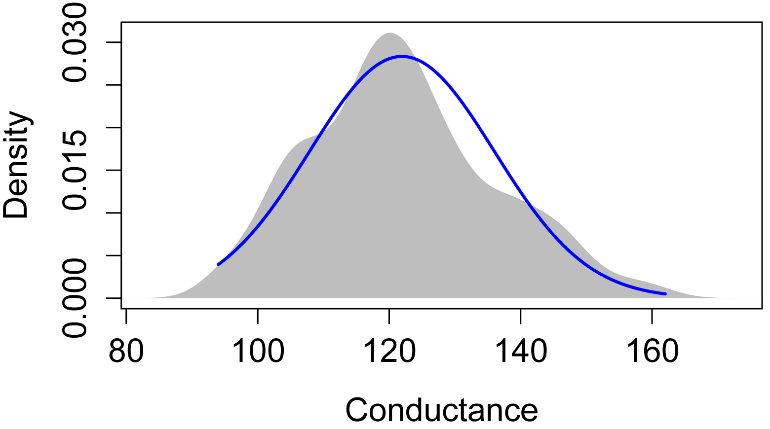
The following plots are histograms of water quality data for U.S. Geological Survey station 1467016, Rancocas Creek at Willingboro, NJ, from approximately 1970 to 1974 (USGS, 2015).
The distribution of pH follows a normal distribution relatively well. It is rather symmetric around a mean of about 6. A normal curve with the same mean and standard deviation as the data has been superimposed as a blue line.
The distribution of conductance shows a slight right skew, but otherwise is relatively symmetric around a mean of about 120.
I would describe the distribution of dissolved oxygen as bimodal. It seems to have relatively many observations clustered around a value of 3 and around a value of 9.
I’m not sure how I would describe the distribution of temperature. If pressed I might say it is relatively uniform. A histogram of a uniform distribution would have all bars of equal height. You might see temperature as bimodal, or of indescribable shape.
Results from the describe function in the psych package are shown below the histograms, and kernel density plots of these distributions are shown below those results.
For examples of skewed histograms, see the “Skewness” sub-section of the “Statistics of shape for interval/ratio data” section in the Descriptive Statistics chapter.


### describe(pH)
vars n mean sd median trimmed
mad min max range skew kurtosis se
1
1 366 6.02 0.24 6 6.01
0.15 5.2 6.7 1.5 0.11 0.84 0.01
### describe(Conductance)
vars n mean
sd median trimmed mad min max range skew kurtosis
se
1 1 366 121.95 14.08 121
121.33 13.34 94 162 68 0.38
-0.26 0.74
### describe(DO)
vars n mean sd median trimmed
mad min max range skew kurtosis se
1
1 354 6.32 3.43 6.35 6.25 4.82 0.5 12.4
11.9 0.09 -1.42 0.18
### describe(Temperature)
vars n mean sd median
trimmed mad min max range skew kurtosis
se
1 1 366 14.48 7.98 14.55 14.54
11.64 1.5 27.1 25.6 0.02 -1.43 0.42


Optional analyses: Plotting with the esquisse package
Plots can also be produced in R with a graphic user interface (gui). One promising R package for this purpose is esquisse.
if(!require(esquisse)){install.packages("esquisse")}
library(esquisse)
esquisser()
Here is a worked example:
• Import data > URL > https://rcompanion.org/documents/PalmerPenguins.csv
• X = island
• Y = bill_depth_mm
• fill = sex
• Change the plot type icon to Bar
• Change Geometries > Position to dodge or dodge 2
• Change Geometries > Stat summary to mean
• You can then change Labels and Title
• You can change Options > Dimensions
• You can then extract the Code for ggplot2 or export the image file

Optional analyses: Misleading and disorienting plots
The need to include measures of variation
The following plot mimics one I’ve seen, showing median salary for non-tenure-track university faculty by race or ethnicity. One minor complaint I have about it is that the x-axis label doesn’t really describe the x-axis. Really, it should be labeled “Race or ethnicity”, and the categories should be listed along the x-axis.
The larger complaint I have is that there are no measures of variation indicated for the medians. As presented, one might say, “Blacks have a higher median salary than do Whites, whose salary is higher still than that of Hispanics.” But I suspect that the variation within each demographic category is much greater than the variation between them. If we had error bars on each bar, we might be less inclined to think that there is a real (statistically significant) difference among groups. Of course, it’s impossible to draw any conclusions without their including measures of variation or statistical analyses.
As a final note, usually if there is no statistical difference among groups, there is no need to plot their values separately. In the example of this plot, if there were no statistical difference among racial groups, we could just report one median for the whole lot, with a five-number summary, or a single box plot. There are exceptions to this; for example, in this case if salaries among racial groups were of some particular interest, we might show statistics for each group even if there were no statistical differences.
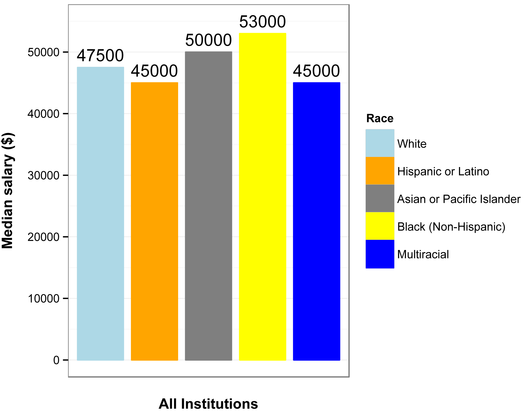
Original caption: “Median academic-year
salary for full-time, non-tenure-track faculty by race or ethnicity,
Fall 2010.”
Original source: American Association of University Professors. 2013. Annual Report on the Economic Status of the Profession, 2012–2013. www.aaup.org/report/heres-news-annual-report-economic-status-profession-2012-13.
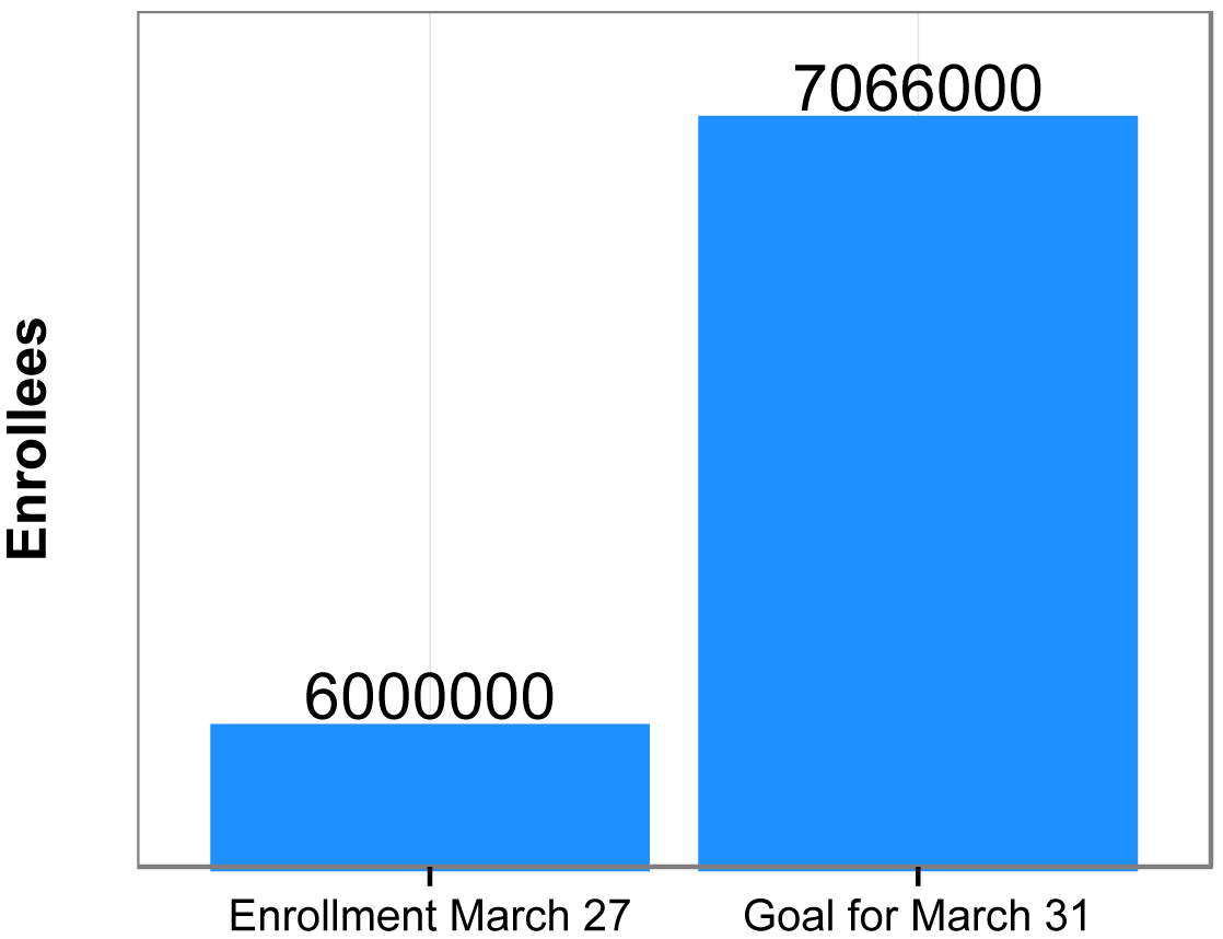
For bar charts, start the y-axis at zero
The following plots mimic plots I saw for the same data on Fox News and The Guardian. They compare the enrollment for the Affordable Care Act (“Obamacare”) in March 2014 to the stated goal for enrollment in March 2014.
The main deficiency of the plot on the left is that the bottom of the y-axis doesn’t represent zero, but 5.75 million, making the difference in the bars look large compared with the size of first bar. For good measure, units on the y-axis are left off.
The plot on the right more honestly depicts the relationship between the difference in the bars and the size of the bars by setting the bottom of the y-axis to zero. Also, units are included on the y-axis.

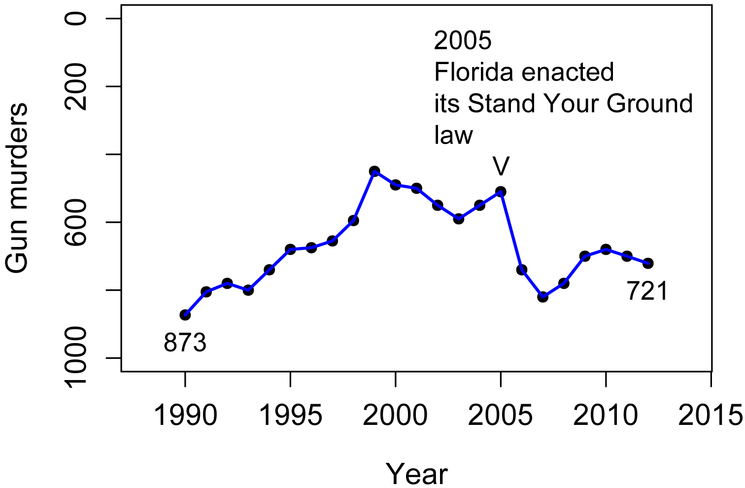
Avoid disorienting the audience
The following plot mimics one released by Reuters in 2014. I didn’t try to mimic the aesthetics of the plot, but you can see the original in the article cited in “Original source” at the end of the section.
The original plot had the confusing heading and sub-heading, “Gun deaths in Florida: number of murders committed using firearms”. Of course, murders aren’t the same as gun deaths, so it’s not clear what is being measured on the y-axis.
A quick look at the plot would suggest that gun murders dropped after 2005. But a more careful inspection reveals that the y-axis is inverted, in that smaller numbers are on the top and larger numbers are on the bottom. Therefore, gun murders went up after 2005!
At first I found it difficult to believe that this plot could have been made in good faith. Most commonly we put larger numbers toward the top of the y-axis. I suspect, though, that the author was using a less-common convention that positive outcomes are put toward the top of the y-axis. It makes sense if you think of zeros murders as the goal, and increasing murders are further below that goal. An example of this convention is the Hickey article in the “Reference” the end of the section. In that article, actors with a low billing score are at the top of the y-axis, since first billing is the best.
Reuters did release a second plot with the y-axis in its normal orientation, which is mimicked in the second plot.
As a final note, there are cases where the y-axis is traditionally inverted. For example when plotting the depth to water table in groundwater hydrology, the surface (0 depth) is plotted at the top, so as the depth increases, the value is vertically lower on the plot.
First plot, with y-axis reversed.
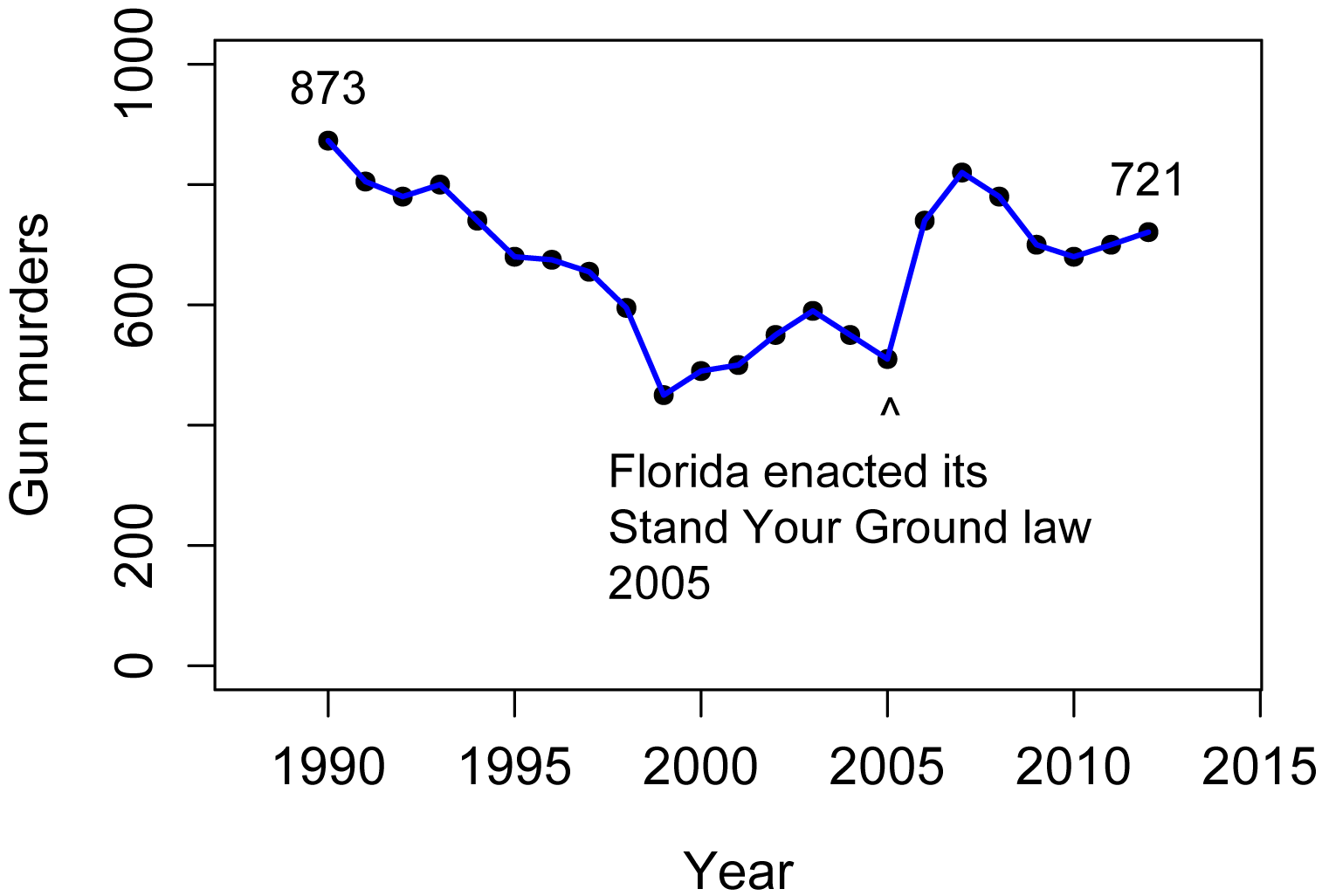
Second plot, with y-axis
in its common orientation.
Original source: Engel, P. 2014. This chart shows an alarming rise in Florida gun deaths after 'Stand Your Ground' was enacted. Business Insider. www.businessinsider.com/gun-deaths-in-florida-increased-with-stand-your-ground-2014-2.
Reference: Hickey, W. 2015. Congratulations, You’ve Been Cast In Star Wars! Will You Ever Work Again? Five Thirty Eight. fivethirtyeight.com/features/congratulations-youve-been-cast-in-star-wars-will-you-ever-work-again/.
Use the best model
The following plot mimics one published by the Organisation for Economic Co-operation and Development. The model they fit to the data is shown as the blue curve. It’s subtle, but the model makes assumptions that may not fit the data well. In particular, the author chose a simple logarithmic model for which y continues to increase as x increases. [In reality, I think they chose a model from the limited options in Excel, probably without thinking about it much.] One implication in this plot is that life expectancy in the United States, USA, is notably lower than what the model predicts.
But I don’t think there’s any good reason to suspect that life expectancy would continue to increase as health care spending increases, beyond some limit. Life expectancy is probably limited by human biology, limits in medical science, and intractable human behaviors. Looking at just the data points and ignoring the blue curve, the data suggest to me that life expectancy increases as spending increases up to about 2500 dollars (about where Israel, ISR, is) and then plateaus. Spending beyond this critical value results in no further increase in life expectancy.
I created the model in the second plot, which uses a quadratic plateau model. With this model, a quadratic curve rises to a plateau. This model predicts a critical level of about 3500 dollars, about where Japan, JPN, is. It also suggests that life expectancy in the United States is lower than the model predicts, but not much more than Switzerland’s, CHE, or Japan’s is above it. But more importantly, this model and other similar alternatives predict a critical value in healthcare spending, above which we should not expect an increase in life expectancy. Of course, there are other factors that would affect life expectancy, and maybe spending above this critical value is warranted in some cases.
The third plot uses a linear plateau model, which is composed of a linear increasing segment and a plateau segment. It fits the data slightly better than the quadratic plateau model, and indicates a critical level near 2500 dollars.

First plot with logarithmic
model.

Second plot with quadratic
plateau model.

Third plot with linear plateau model.
Original source: OECD. 2013. Health at a Glance 2013. www.oecd.org/els/health-systems/Health-at-a-Glance-2013.pdf.
References
Apple 2015. “Numbers for Mac.” www.apple.com/numbers/.
Chang, W. “Graphs with ggplot2.” No date. Cookbook for R. www.cookbook-r.com/Graphs/index.html.
LibreOffice. 2015. “Calc.” www.libreoffice.org/discover/calc/.
Microsoft. 2015. “Excel.” www.microsoft.com/en-us/microsoft-365/excell.
Robbins, N.B. and J. Robbins. 2016. Effective graphs with Microsoft R Open. www.joyce-robbins.com/wp-content/uploads/2016/04/effectivegraphsmro1.pdf.
[USGS] U.S. Geological Survey. 2015. National Water Information System: Web Interface. waterdata.usgs.gov/nwis/.
Wickham, H. 2013. ggplot2 0.9.3.1.
Optional readings I
“General tips for all graphs” in “Guide to fairly good graphs” in McDonald, J.H. 2014. Handbook of Biological Statistics. www.biostathandbook.com/graph.html.
“Exporting graphics” in “A Few Notes to Get Started with R” in Mangiafico, S.S. 2015. An R Companion for the Handbook of Biological Statistics. rcompanion.org/fanion/a_06.html.
Optional readings II
[Video] “Understanding summary statistics: The box plot” from Statistics Learning Center (Dr. Nic). 2015. www.youtube.com/watch?v=bhkqq0w60Gc.
“Graphing Distributions”, Chapter 2 in Lane, D.M. (ed.). No date. Introduction to Statistics, v. 2.0. onlinestatbook.com/. (Stem and Leaf Displays, Histograms, Frequency Polygons, Box Plots, Bar Charts, Line Graphs, Dot Plots.)
“Stem-and-Leaf Graphs (Stemplots), Line Graphs, and
Bar Graphs”, Chapter 2.1 in Openstax. 2013. Introductory Statistics. openstax.org/textbooks/introductory-statistics.
“Histograms, Frequency Polygons, and Time Series
Graphs”, Chapter 2.2 in Openstax. 2013. Introductory Statistics. openstax.org/textbooks/introductory-statistics.
“Box Plots”, Chapter 2.4 in Openstax. 2013. Introductory Statistics. openstax.org/textbooks/introductory-statistics.
“Scatterplots for paired data” , Chapter 1.6.1 in Diez, D.M., C.D. Barr , and M. Çetinkaya-Rundel. 2012. OpenIntro Statistics, 2nd ed. www.openintro.org/.
“Dot plots and the mean” , Chapter 1.6.2 in Diez, D.M., C.D. Barr , and M. Çetinkaya-Rundel. 2012. OpenIntro Statistics, 2nd ed. www.openintro.org/.
“Histograms and shape” , Chapter 1.6.3 in Diez, D.M., C.D. Barr , and M. Çetinkaya-Rundel. 2012. OpenIntro Statistics, 2nd ed. www.openintro.org/.
“Box plots, quartiles, and the median” , Chapter 1.6.5 in Diez, D.M., C.D. Barr , and M. Çetinkaya-Rundel. 2012. OpenIntro Statistics, 2nd ed. www.openintro.org/.
“Contingency tables and bar plots” , Chapter 1.7.1 in Diez, D.M., C.D. Barr , and M. Çetinkaya-Rundel. 2012. OpenIntro Statistics, 2nd ed. www.openintro.org/.
“Segmented bar and mosaic plot” , Chapter 1.7.3 in Diez, D.M., C.D. Barr , and M. Çetinkaya-Rundel. 2012. OpenIntro Statistics, 2nd ed. www.openintro.org/.
Exercises E
1. Look at the histograms of the steps separately by male and female students.
a. Would you describe the distribution of each as
symmetrical, skewed, bimodal, or uniform?
b. If skewed, in which direction?
c. For the data for steps for female students, would using
each of the following be appropriate?
2. Look at the box plot of the steps taken by all students.
a. Estimate the minimum, 25th percentile, median,
75th percentile, and maximum.
b. Write a few sentences interpreting these results. For example, what is the meaning of the median? Is the range of the data large relative to its median value? Are there outlying values? What can you say about the middle 50% of students?
3. In box plots including the mean, a symmetrical distribution will have the mean close to the median, and the box will be symmetrical on either side of the median line. Looking at the box plot of the steps taken by female and male students, would you describe the distributions of each as symmetrical or skewed?
4. Looking at the plot of mean steps for female and male students, estimate the mean of each.
5. It is justified to say that group means with non-overlapping 95% confidence intervals are statistically different. Looking at the plot of mean steps with confidence intervals for female and male students, are the two means statistically different?
6.
a. Looking at the interaction plot for mean steps for female and male students by each class, do the error bars for standard error overlap or not for each teacher?
b. Write a couple of sentences interpreting these results. Include the practical importance of the results. (For example, is the difference in means in a certain class large enough to be practically important? You might consider the difference in means as a percentage of the absolute value of the mean. Also, consider the spread of the data or the standard errors of the means.)
7. Look at the scatter plot.
a. Does it look like there is a correlation or relationship
between Steps and Rating, or not?
b. If so, how would you describe it? (“As
Steps increases,
Rating…”)
c. Is the relationship of practical importance? (Consider, for example, how much Rating changes over the range of Steps.)
8. Look at any of the plots for nominal data.
a. Are there more females or males in these classes?
b. In which class is the greatest disparity?
c. Write a couple of sentences reporting these results. (For example, are there big differences among the classes? What are the sum for male and female students? Do you conclude something interesting from these data?)
9–11. As part of a nutrition education program, extension educators had students keep diaries of what they ate for a day and then calculated the calories students consumed.
Student Teacher Sex Calories Rating
a Tetsuo male 2300 3
b Tetsuo female 1800 3
c Tetsuo male 1900 4
d Tetsuo female 1700 5
e Tetsuo male 2200 4
f Tetsuo female 1600 3
g Tetsuo male 1800 3
h Tetsuo female 2000 3
i Kaneda male 2100 4
j Kaneda female 1900 5
k Kaneda male 1900 4
l Kaneda female 1600 4
m Kaneda male 2000 4
n Kaneda female 2000 5
o Kaneda male 2100 3
p Kaneda female 1800 4
For each of the following, answer the question, and show the plot or other output from the analyses you used to answer the question.
9. Plot a histogram of the calories consumed for males and females.
a. Write a caption for this plot. Submit the plot and caption.
b. Would you describe the distribution of each as symmetrical, skewed, bimodal, or uniform?
10. Produce box plots of the calories consumed for males and females.
a. Write a caption for this plot. Submit the plot and caption.
b. Report the 25th percentile, median, and 75th percentile. (Estimate from the plot, or report more precise statistics.)
11. Plot means of the calories consumed for males and females. Include error bars for either confidence intervals or standard error of the means. You can use either qplot or ggplot, and you can use either the bar chart style or the "plot of means" style.
a. Write a caption for this plot. Submit the plot and caption.
b. Add a sentence reporting the respective means in the caption.
c. Are the calories consumed likely to be statistically different?